Jay Bee
Well-known member
2026/27/28 Home Kit
Is it just two colours... "red and white, always together?"Two seasons of the kit ?

Then again

It's Always Twogether except when a kit manufacturer or sponsor change is imminent....

Is it just two colours... "red and white, always together?"Two seasons of the kit ?
played sh*t today.
whys that?
kit didnt have the intricate designs woven into the fabric.

Goalkeeper kit 26/27 is also on the site...probably not worth its own thread
View attachment 67211

"The wave pattern represents Brentford's always fluctuating form...."f***ing hell that's lucky I thought it was the away kit

Presumably a reference to the two season longevity but clearly doesn’t workCan someone please explain what "twogether" is meant to convey/mean?
it's a bit cringey, but how does it not work?!Presumably a reference to the two season longevity but clearly doesn’t work
Yes interesting the clue about this kit was hiding in plain sight, these images were on the OS announcement in AprilSo turns out the sponsor announcement was on the real kit
View attachment 67210
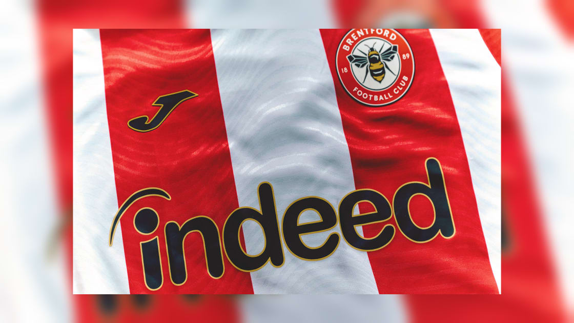
 www.brentfordfc.com
The backwards J on the left shoulder is strange. As if the enormous Cazoo A/car isn't clutter enough.Not a massive fan of the black/yellow trim, but I think the yellow on the shirt is nice.
Really wish Joma would give the J on the sleeves a miss, too much going on there.
But overall I think it is actually a decent top, and definitely an improvement on last seasons one.
Indeed being on there is genuinely great, a massive upgrade on that nonsense Hollywood Bet.


Yellow trim.I quite like it, prefer the long sleeve version but have they managed to f*** up the shorts?
It's certainly true that I am considering wtf it means. But no closer to a conclusion.no because it makes one stop and consider it more fully rather than just a bland/normal word that you read a thousand times and are blind to it.

I was wondering what the difference is because, if you follow the link and then click on the replica shirt, it also shows a solid red back, like the authentic one.It's the same prices as last year.
£65 for the fans shirt with a striped back
£95 for the "authentic" shirt with a plain red back.


Not bad, but the backpack straps?

I agree, see later post 38I was wondering what the difference is because, if you follow the link and then click on the replica shirt, it also shows a solid red back, like the authentic one.
Am I reading that post right: the extra £30 for the authentic shirt gets you a stick-on badge, instead of an embroidered one?I agree, see later post 38

Yes, players don't have the embroidered badge as it adds weight to the shirt.Am I reading that post right: the extra £30 for the authentic shirt gets you a stick-on badge, instead of an embroidered one?
I sort of get the logic, but it's not like working out how much fuel to put in a formula 1 car, at a pit-stop.Yes, players don't have the embroidered badge as it adds weight to the shirt.

It all adds up, they took 4 threads out of the boot laces too. And shaved off 2 microns from the studs.I sort of get the logic, but it's not like working out how much fuel to put in a formula 1 car, at a pit-stop.
Oh no, a collapsing wave form. We’re doomed."The wave pattern represents Brentford's always fluctuating form...."
(This may not be real publicity)


Why thankfully?The fans one is a plain red back too now thankfully
If they’re anything like last year’s they’ll have fallen off before the end of the seasonThe backwards J on the left shoulder is strange. As if the enormous Cazoo A/car isn't clutter enough.
View attachment 67215

what utter marketing codswallop.Yes, players don't have the embroidered badge as it adds weight to the shirt.
Part of the masterplan so you buy another the following season.If they’re anything like last year’s they’ll have fallen off before the end of the season

After the first thumping home win, you’ll sing a different tune!The front is definitely cleaner than last seasons mess but with the yellow and a solid red pane on the back I'm afraid it's just not a Brentford shirt to me. 3/10.

Less obvious that you've bought the cheapo oneWhy thankfully?

After the first thumping home win, you’ll sing a different tune!
I wasn’t a fan of the idea that anybody who wanted to get printing on the shirt either had to pay £30 more than usual to get the authentic version, or have a shirt that looked completely different to the one we actually wore on the pitch.Why thankfully?
Stripes on the bottom third… and thankfully red, not black!There'll still be no stripes on the back though. It'll be like watching a bunch of Liverpool fans walking down the road.
There are at the bottom of the shirt and the rest of the red section of the back will have a name and number in white on it, similar to last season, so it will look less ‘red’.There'll still be no stripes on the back though. It'll be like watching a bunch of Liverpool fans walking down the road.


It's from the old Club crestQuite like the beehive on the back below the neck - is that from somewhere in the archives?
View attachment 67203


 the downsides are too much Joma advertising on the arms etc…the back will look better with a name and number on it….will sell well I’d imagine


This is probably asking too much but why not have 2 fan versions - 1 with red block and 1 with stripes so that those adding personalisation can buy that red block version etc.with fan version not having a striped back...
is the plan to encourage people to then get a name & number printed as can look odd without?
to me it puts me off buying as i wouldn't want a name & number on the back

 vibes
vibes


